

What grabs your attention first when you visit your favorite website? Is it the impressive vocabulary? The font choice? The page title?
For most of us, the image is the first page element that catches our eye. Having a great image at the top of your fundraising page can make a big impact on the success of your campaign. Keep in mind that your image will shape an audience’s first impression and appear in all your social media promotions. So take a little time to choose a compelling image, and don’t be afraid to do some editing and make it the best it can be.
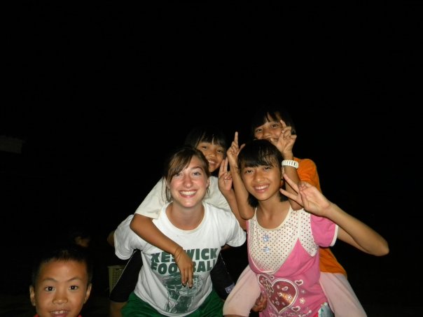 Select a picture that shares part of your story, or tells something interesting or fun about you. Make sure it
is a nice, clear image. A fuzzy photo, or one that has no relation to you or your fundraising campaign, won’t
reach your audience.
In our example below, we have the picture Heather used in a fundraiser for her mission trip to Thailand. Heather had been to Thailand before, so she chose a picture from that trip. It was a great choice because it showed her having fun with some kids from Thailand.
If your picture has a busy background that distracts from the main subject, use a photo editor to crop the image. Photo editors can also be used to highlight the most important subject by darkening or blurring the background.
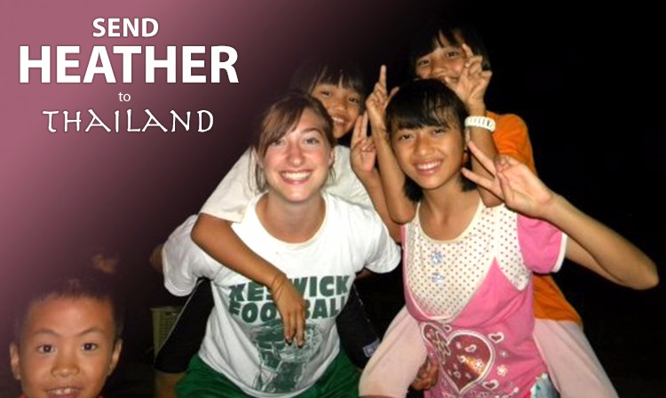 Adding some details about your fundraiser can be one of the most important changes you can make to your image. When it is seen on your page or shared via social media, this information will quickly tell your community what your fundraiser is all about. We highly recommend taking the time to add some information to your image. You can use
Photoshop, one of the many free online photo editing services (
Canva or PicMonkey, for example), or even many smartphone photo editors, like
Over.
Look at the difference a little cropping and Photoshopping did for Heather’s image.
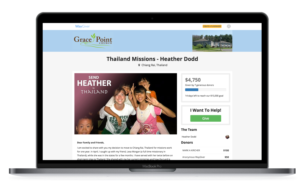
It was this image that was promoted on Facebook and even put on the homepage of the church that sponsored her trip.
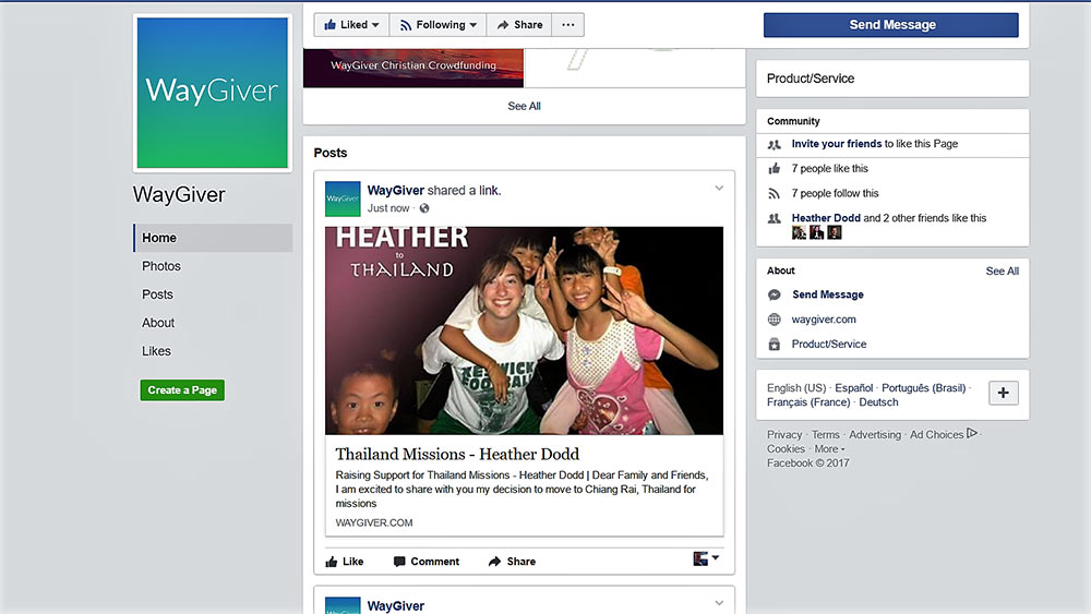
We have even used it in several places at WayGiver.com.
Related Articles
Writing An Effective WayGiver Crowdfunding
Description
Promoting Your WayGiver Crowdfunding Campaign
WayGiver - Be a blessing!